Charts Overview
The Charts Overview screen provides useful information about charts, and quick comparison between them.
Open it by clicking on the icon in the header bar :
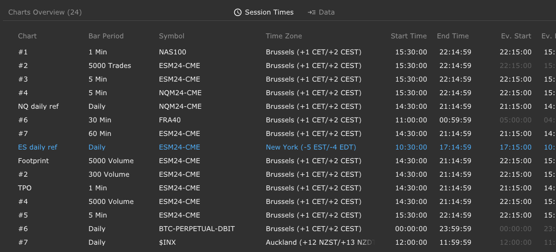
This screen displays the list of all the charts the Sierra++ study is installed on, and it contains 3 tabs.
The 3 columns on the left side are common to every tab :
Chart Name(or Chart Number if no name is set)Bar PeriodSymbol
You can sort the charts by clicking on the name of the column.
The chart displayed with the Accent Color (blue in the screen shots) is the currently active Chart in Sierra Chart.
Session Times & Data tabs

The first tab shows the essential information about session times :
Time ZoneStart TimeandEnd TimeEvening Session Start TimeandEvening Session End Time(if any)Start Time of Day
The information is retrieved as-is from the Chart Settings screen (‘Session Times’ tab).
The ‘Data’ tab provides information about the amount and the time range of the data loaded into the chart :
Days to LoadStart DateEnd DateContinous Futures Contractoption
The information is retrieved as-is from the Chart Settings screen (‘Data Limiting’ tab).
Days to load and Start/End date are typically exclusive.
Studies tab (Study Map)
This tab displays which Study is installed on which Chart :

Hovering a chart hightlights all the studies installed onto it.
Hovering a study highlights all the charts a study of this type is installed on.